As far as business buzzwords go, the terms Big Data, data visualization, data structure, predictive analytics and business intelligence all get thrown around with the frequency of a used car salesman putting together his best customer pitch. In fact, when it comes to acquiring a business intelligence tool, you might hear the mention of these terms ad nauseam. That being said, if you’re truly serious about implementing business intelligence technology into your workflow, then you need to be absolutely positive of the different initiatives that you want to fulfill.
Even if your business intelligence (BI) dashboard ends up looking professional and offers beautifully rendered graphs that you can use to wow your company’s CEO, it won’t mean anything unless you have the right data in the right dashboard. That’s why Himanshu Sareen, CEO of Icreon Tech, has compiled a list of the best practices for choosing a well-designed business intelligence dashboard.
How to Choose a Well Designed BI Dashboard
Click through for best practices organizations should consider when choosing a business intelligence (BI) dashboard, as identified by Himanshu Sareen, CEO of Icreon Tech.
Strong Visual Representation
The first best practice when it comes to BI dashboard design is the bare basics of how you should want your dashboard to be represented visually. First and foremost, a BI dashboard gives you a high-level look into your company’s key performance indicators (KPIs) so that you can assess the various goals that matter to your position or business as a whole. That being said, it’s a BI tool’s job to aggregate and arrange data so that it’s relevant and highly visible to end users who depend on accurate information in order to make high-level decisions that impact a company’s welfare.
Strong Visual Representation
Let’s say that you’re a retail company that makes printed shirts. A BI tool would potentially be important for analyzing how many times your company or one of your products is mentioned on social media. Why? Let’s also hypothetically say that based on Big Data analysis you know that every 1,000 likes and/or tweets that a particular product receives raises the consumption of that product by 10 percent for as long as its presence is viral on social media. This information would obviously impact how much inventory you need to fulfill the projected increase in orders for the previously mentioned product — and essentially a good BI tool should help you connect the dots in real time so that you can take action more quickly.
Strong Visual Representation
This is why visual representation is so important when it comes to choosing a dashboard. Not only do you have to choose the most essential KPI’s to monitor, but you must choose a dashboard that lets you see the forest through the trees, so to speak. Here’s a list of visual properties that a BI tool should be comprised of:
- It should put key metrics into context so that end users understand the correlating information that can help explain a spike or a dip in performance.
- The information on a BI dashboard should be dense but not cluttered to the extent that it’s difficult to differentiate data points.
- It should also have a very low learning curve, meaning that graphs and information should be presented in not only an aesthetic way but in a way that is easy for end users to understand — even if those end users have a relatively low level of technical background.
At the end of the day, remember that any BI dashboard’s visual representation is extremely important in terms of user experience, and being able to put heightened information to use depends greatly on users being able to understand the information that’s presented to them.
Communicate Information from a Single Screen
BI technology is all about being able to communicate the right information at the right time, and being able to compare information easily is a big part of that communication process. That’s why your dashboard’s most critical information should fit on a single screen. Whether you’re analyzing how your business generates leads, or how your national retail campaigns stack up from a regional standpoint, having all the critical information at your fingertips is essential. The following are a couple of good examples of what a dashboard should look like, and the types of disparate information it should contain.
Dashboard Example
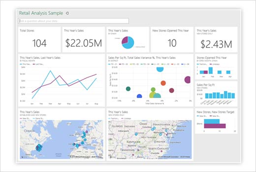
This example is of a dashboard whose aim is to communicate retail analysis. It breaks down total stores, total sales, and then separates that from new stores (and the sales done in those stores), making it easy to see how well the new sites are developing. It also connects this year’s sales to last year’s and correlates that information to sales per square foot of store space — which would be essential in calculating whether to open/close new stores in the future, and how many should be opened/closed.
Dashboard Example
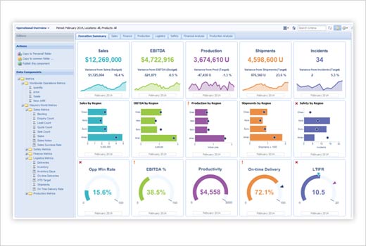
This example offers an executive summary of how a company is performing. It gives detailed information on the company’s net income vs. sales, production, and unit shipments. This information would obviously be pertinent for employees such as general managers and is commutable all the way up to the CEO.
Make Sure Any BI Tool Fits Your Needs
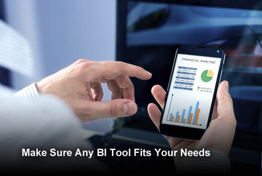
The last tip for choosing the right BI dashboard has to do with customization. There are plenty of off the shelf BI solutions such as the software that IBM offers, and there are customizable software options such as Yellowfin — which will build your BI platform to fit the exact specifications you require. There are myriad reasons for choosing either off the shelf or custom software to fulfill your BI needs, but whichever you choose, make sure that your suite is customizable to your specific needs (in this instance, customizable is synonymous with easy usability — meaning that you shouldn’t have to ask the IT department every time you want to run a report) and that it can be used unilaterally across departments.
Conclusion
Making an investment in BI technology is no small thing for a company as it can be expensive to implement and operate. That’s why it’s of paramount importance that you take an in-depth look at what design capabilities you require in a dashboard so that it’s easy for your workforce to use, and so it has a significant impact on growing your bottom line.


