Oftentimes, the interview process focuses on skills and experience, but when interviewing developers, rarely are questions asked about whiteboarding.
Whether a team uses whiteboards to brainstorm, demonstrate an answer, diagram a solution, or talk through complexities with requirements, whiteboards can be a valuable collaboration tool.
Table of Contents
Understanding Whiteboards
Simply stated, whiteboards are visualization tools. Content added to a whiteboard can be as permanent or temporary as each situation requires.
Online whiteboards bring this process to a digital space, providing the opportunity for collaboration amongst team members that don’t share the same physical space as well as providing shared documentation that can be more easily accessed for future use.
In addition, whiteboards are intended to be organic, inviting users to participate in content creation and the resulting discussion. Other functions of whiteboards include the ability to:
- Brainstorm, explore, and share ideas.
- Solve problems, strategize, and perform analysis tasks.
- Create high-level design diagrams to walk users through functionality or proposed solutions.
- Plan projects and resources.
- Teach and learn new concepts.
- Plan sprints and group tasks.
Whiteboard Coding
In the development process, it can be helpful to temporarily abandon the constraints of an IDE (integrated development environment) and think through the necessary logic required. Taking a step back from strict syntax and formatting can offer fresh inspiration on how to tackle the next stages of development.
In more complex situations, illustrating the situation can make it easier to solicit feedback or advice, particularly from team members who may be familiar with the project but are not also developers.
Whiteboards should supplement and support development efforts, and care should be taken to ensure they don’t negatively impact productivity. Whiteboards aren’t intended to be a primary coding method.
Also read: The Importance of Usability in Software Design
Common Whiteboard Application Features
Whiteboard applications share a number of features, including:
- Taking the form of a native application (desktop or mobile) or being browser-based.
- Unlike physical whiteboards, space isn’t limited and can scale as needed.
- Depending on the device being used, content can be added using a keyboard, mouse, digital pen, stylus, or fingertip.
- Whiteboards can include shapes, pictures, images, and other interactive media content.
- Participants are able to select, move, resize, edit, and delete content.
- Voting sessions allow participants to decide on the importance and priority of various ideas, features, or functionality.
- Commenting allows contributors to provide feedback, introduce additional questions or considerations, or to encourage additional discussion.
Also read: Using Swim Lane Diagrams to Improve Software Development
Top 5 Whiteboard Applications
There are a large number of whiteboard applications available, but five stand out as the top choices.
Note that the costs included below may not be inclusive of the price for applications needed by mobile or desktop devices when not accessing the whiteboard using a web browser.
Miro
Pros:
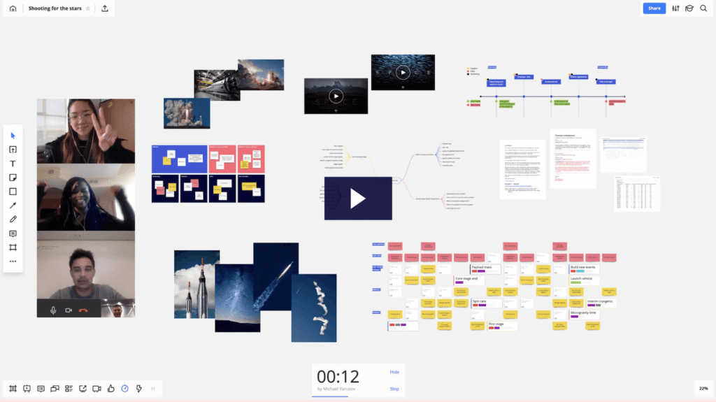
- Miro includes several useful templates to get you started.
- The versatile user interface (UI) allows organizations to customize their whiteboards to best suit their processes, workflows, and objectives.
- Hand-written notes can easily be integrated into your whiteboards.
Cons:
- With the considerable number of features and functionality offered by Miro, the UI can feel cluttered and confusing to new users.
- Administrative functions such as moving boards between teams can be difficult.
- Large boards can be slow to load to the viewer’s screen.
Platform Compatibility:
- Miro is compatible with Mac, Windows, iOS, and Android.
Cost:
- Basic plans are free.
- Team features are available with plans starting at $16 per user, per month.
- Enterprise plans are available with custom pricing and include enterprise-grade security and compliance, centralized account management, and additional data governance functionality.
- Plans paid annually receive a 20% discount.
Microsoft Whiteboard
Pros:
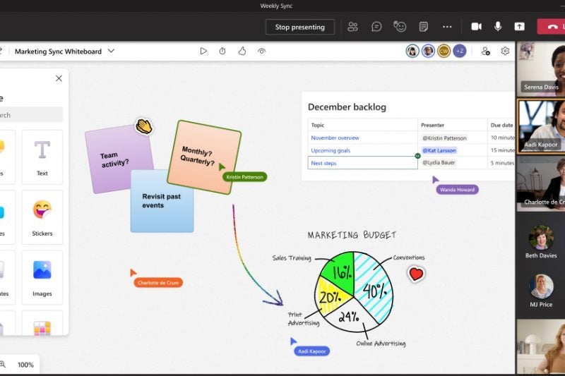
- The familiar Microsoft layout and interface design reduces the learning curve.
- The ability to easily embed other Office documents and work seamlessly within Teams makes Microsoft Whiteboard ideal for organizations using the whole 365 ecosystem.
- The pen experience within Microsoft Whiteboard is applauded as being the most like an actual pen.
- The artifact is not lost when a whiteboard is shared, making it easy to go back and make revisions or additions.
Cons:
- Microsoft Whiteboard often tries to turn ink into computer text, which isn’t always ideal.
- For organizations with users accessing whiteboards using a variety of endpoints and platforms, Microsoft Whiteboard doesn’t always provide an equivalent experience for everyone.
- There is a lack of useful connectors for products like Visio.
Platform Compatibility:
- Microsoft Whiteboard is compatible with Windows, iOS, and Android.
Cost:
- Microsoft Whiteboard is free with a Microsoft account, and additional functionality is available with a Microsoft 365 subscription.
MURAL
Pros:
- MURAL integrates easily with the software already being used by your organization, including Teams, Asana, Azure AD, Adobe Creative Cloud Library, and more.
- Users can easily work with collaborators in real time or asynchronously.
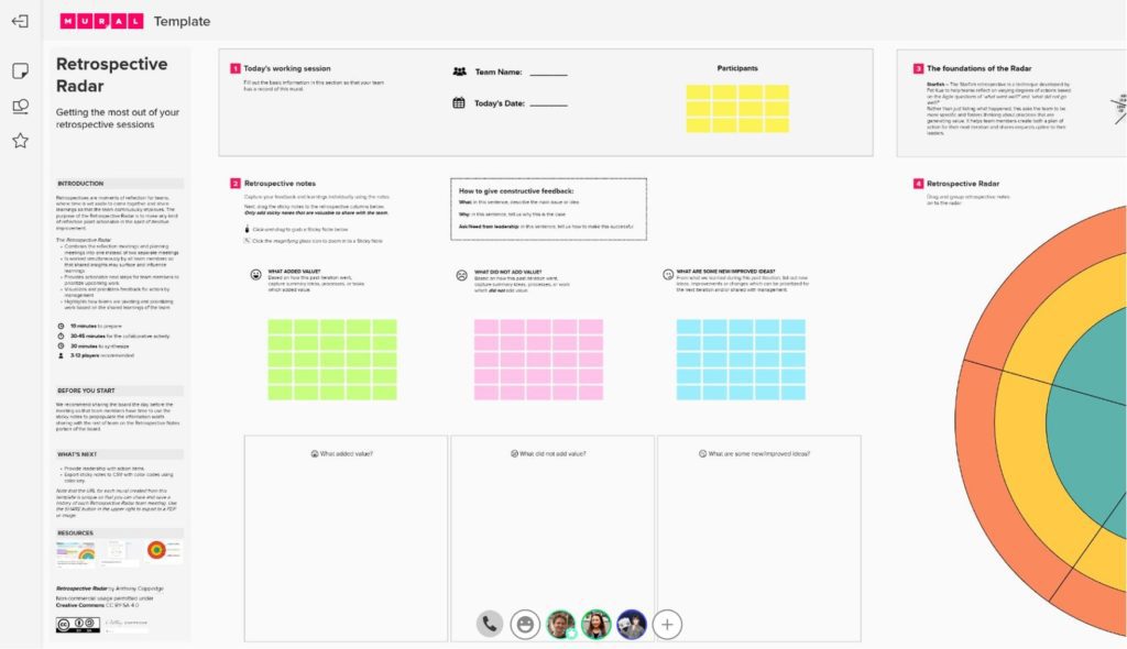
- Projects can be started using templates.
- Interactive elements allow for things like summoning collaborators back after a break.
Cons:
- The visual interface tends to lag when larger numbers of users are making modifications simultaneously.
- Private boards require premium plan subscriptions.
Platform Compatibility:
- MURAL is compatible with Mac, Windows, iOS, and Android.
Cost:
- The Free plan is best for organizations only needing a maximum of 3 whiteboards.
- Unlimited whiteboard plans with additional privacy controls for teams are available for $9.99 per user, per month.
- Business plans with SSO and advanced integrations (Jira and GitHub) are available for $17.99 per user, per month.
- Enterprise plans with centralized administration and enhanced security are available with custom pricing.
Explain Everything
Pros:
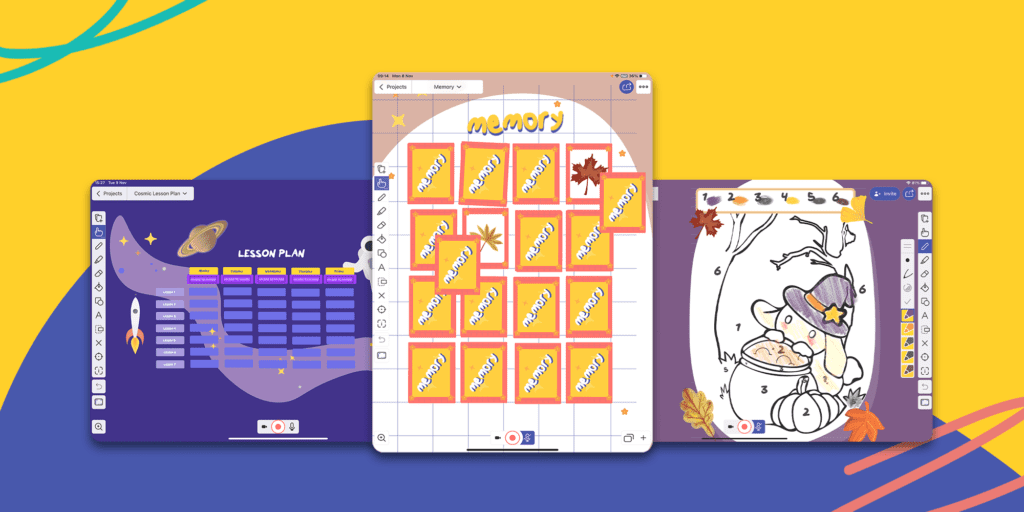
- Explain Everything is celebrated for piecing whiteboard content together into explainer videos, making it ideal to use as an educational tool.
- Whiteboards are designed to be more of a teacher-student classroom-style collaboration tool, with built-in functionality for guiding others through lessons or content.
Cons:
- The drawing features are not as sophisticated as those found in competing whiteboard applications.
- While the user interface makes easy tasks very easy, more complex tasks are almost impossibly difficult.
Platform Compatibility:
- Explain Everything is compatible with Mac, Windows, iOS, and Android.
Cost:
- The basic single-user plan is free, and team plans begin at $11.99 per user, per month.
- Education plans are also available for students, teachers, and other educators.
Zoom
Pros:
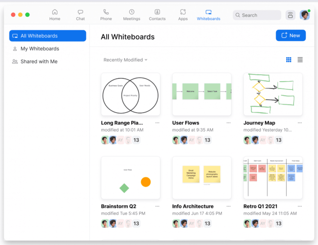
- The whiteboards are available to all Zoom users who are already engaged in a familiar, collaborative, online meeting application.
- Finished whiteboards can be saved as images and shared.
Cons:
- Whiteboards can only be initiated by the meeting host, who can then transfer the sharing rights to other participants.
- The function is only intended for brief collaboration sessions during Zoom meetings and not ongoing, long-term whiteboarding.
Platform Compatibility:
- Zoom is compatible with Mac, Windows, iOS, Android, and Linux.
Cost:
- The cost for whiteboard functionality is included with Zoom membership pricing.
Tips for Using Whiteboard Applications
There are as many ways to use a whiteboard as there are items pinned to your tried-and-true bulletin board. That said, there are a few best practice tips and tricks that should be considered.
- Practice makes perfect. Feeling empowered and free to contribute to a whiteboard is an expertise that takes time to develop.
- Give your content meaning. If you want something to stand out, write it in red. If you want to show the flow of a process or idea, use an indicative arrow. Taking some time to standardize your whiteboarding strategy will pay off with more meaningful and easier to understand whiteboards.
- Make good use of space. Knowing users may be accessing and contributing to your whiteboards using a variety of devices and endpoints, means screen sizes and resolutions can vary tremendously. Make choices regarding font and shape size carefully, and try to minimize the need to scroll for the most important information.
- Brainstorm first, edit later.
Turning Ideas into Tasks
There are reasons why so many offices have physical whiteboards hanging on the walls, usually covered in sketches and jot notes that are tied together with lines and arrows, sometimes circled, often with question marks or additional notes added on later. They may even have a sticky note or two.
Unfortunately, these physical whiteboards have limitations. Even when you disregard their need for members to be in the same location, content isn’t dynamic. You can’t add screenshots, images, or other multimedia. Everything must be recreated or described. Plus, it can be difficult enough to organize our own thoughts, let alone share them in a clear and meaningful way with others.
By contrast, whiteboard applications are always accessible, living things. We can ask questions and see how they get sketched out. We can send our creations to peers and experts for advice or suggestions. We can make note of things to remember or add reference points for later consideration.
Whiteboards don’t have the permanence of documentation. They don’t need to be beautifully formatted or proofread. They often come with the understanding that they may not even be technically accurate or current. They are collaborative tools, allowing teams to think out loud together in a functional way.
Read next: Identifying Software Requirements Using 5 Whys and 5 Hows


